
We‘re introducing a range of enhancements to the RedView user interface to make the software even easier to use.
Using AI to help analyse and refine the interface, we’ve made a number of improvements designed to:
Make it easier to navigate around the system.
Provide more screen space for the information you use every day.
Use colour more effectively to help important information stand out.
Introduce a simplified and more intuitive menu system.
These improvements are being rolled out progressively over the next three to four software releases. The first enhancements will be included in tonight’s release, with additional refinements following over the coming updates.
The most noticeable change in this release is the redesigned menu system. While the changes are not extensive, they have been carefully designed to make navigation more intuitive and maximise the amount of screen space available for your work.
A revised menu
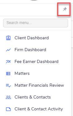
We’ve replaced the large icons with a more compact menu that combines smaller icons with clear text labels, making it quicker to find the area you're looking for while leaving more screen space for your work.
Pin the menu your way
The new Pin button lets you choose how you want the menu to behave.
Pinned (Full Menu): Keep the full menu permanently visible (as above).
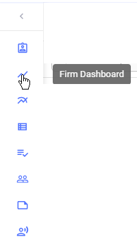
Pinned (Compact Menu): Keep a slim version of the menu visible to maximise screen space (as below)
Unpinned: The menu stays hidden until you need it.
Your preference is remembered
Once you’ve chosen your preferred menu style, RedView will remember it. The next time you log in, your menu will appear exactly as you left it.
These are relatively small changes, but we think they’ll make navigating RedView simpler, faster and more intuitive.
The RedView Team