Hi guys,
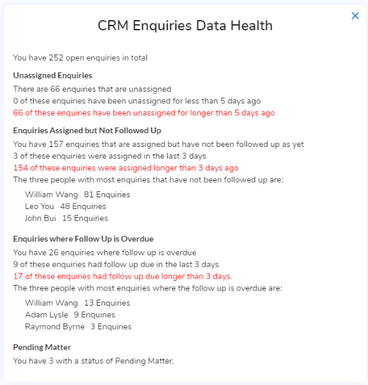
We added a new chart to the Enquiries Dashboard last night, an example for JB Solicitors is below. It is meant to provide an overview of “bad” data and make it more visible so that they will get the data entry done and potentially look after their data properly – a pipedream I know!
We can also use it as the basis of discussion for how we can help them use the system better.
I am getting Rohaan to turn it on as the first chart on the Enquiries Dashboard for all clients so it will be interesting to see if anyone notices it.
Note that there are no drill downs, if they want to see the details they need to go to the enquiries list and filter by status.
Stephen.